Charting the market: the ETFYourself way
It is all about multiple time frames and gathering "evidence"
Here are two statements that, if you hear them, you should quickly move on to something more useful:
I know the market is going to go up
I know the market is going to go down
No one knows, but social media is filled with people who say they do. They don’t.
So, as part of being a subscriber to ETFYourself.com, I invite you to share with us anything you see online that you want to have us run through the “BS meter.” We’ll check it out and include it either in a post or in an upcoming “Ask Me Anything” live session.
No one knows for sure what will happen in any part of the market, at any time. Yet I think we can all agree that ANY investment can rise in price at ANY time. It is just a matter of how much risk of major loss is attached to it. So, while I never KNOW what any ETF or market segment will do, I can develop, test, and evolve a toolbox of indicators and processes to provide me with as much confidence as reasonably possible, while adhering to my #1 investment rule of “Avoid Big Loss (ABL).”
Every Thursday in our free newsletter, we update some of the investment indicators I’ve created and honed over the decades. Others are updated each month, or when market change sharply (hint: tomorrow I’ll post to the site a rare mid-month update to our Market Outlook Factor Overview, or MOFO).

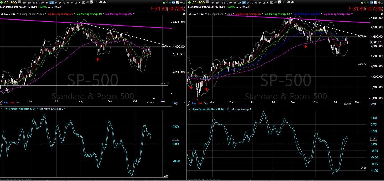
So, we have a stock market that is as frenetic as we’ve seen all year, and indecisive above all else. For the S&P 500 at least, it is stuck in the mud. That prompted me to look at its chart situation over all 12 time frames I look at regularly. FYI, those time frames are charts where each “bar” or piece of the chart is a period of anywhere from 1 minute (1m) to quarterly (Q), as shown here:
I use a few charting systems, and when I post a chart from this one (TC2000), you’ll see this box in the upper left corner. I won’t bore you with a dozen charts (though during Ask Me Anything sessions, that’s fair game if requested). Instead, here is a summary of what I see. I’m not looking at this as “buy or sell” because as our ROAR Score documents each week, it is always a matter of positioning between 0 and 100, not 0 or 100.
The S&P 500 here at 1:30 on Wednesday, 10/18/23:
Intraday picture (1 minute, 5 minute, 15 minute and 30 minute charts) leans bearish, but not overwhelmingly so. These change constantly, and unless you are a day trader, they are of minimal use. But I check them to get a mental history to determine when something important may be poised to happen.
Short-term picture (1 hour, 2 hour, 4 hour, 1 day charts) is the most concerning right now. And keep in mind that when the market “speeds up” (gets very volatile), these time frames can be used like we would normally use longer-term charts. I recall early 2020, as the pandemic hit. The market moved in an hour what might have taken a week.
The key is not to “swing at every pitch” but rather to gather evidence of what is occuring, with the ultimate question being “where on that 0 to 100 scale should I be to have the best balance of reward and risk, and not have to change my mind every hour or every day?”
The one chart I’ll show you here is a side by side look at the 2 hour and 4 hour views. These show me the strongest evidence that a breakdown may be in progress. I see a drooping (that’s a technical term…not) price, and the bottom of the chart shows my favorite momentum indicator (the PPO), having just topped on the 2 hour and close to rolling over on the 4 hour as well.
The bottom line: what started recently in the intraday time frames a few days ago may now be bleeding over to the short term. That means at the margin, more defense versus offense. That said, the ROAR Score is very low (10), so this is something that evidence from longer-term charts spotted a while back. This just tells me the risk we prepared for already in our model portfolios is now closer to seeing the price follow through, to the downside.
Longer-term picture (3 day, weekly, monthly, quarterly charts): I say longer-term and not “long term” because I believe the way markets now function, long-term investing requires a series of shorter-term moves. Set it and forget it is NOT part of my approach. Tactical management is.
These time frames are doing what I’d expect them to do when the shorter-term picture appears to be weakening. They are weakening as well, but to a lesser degree.
Think of it like this: before you get the flu, you start to feel some symptoms. And before you feel multiple symptoms, you start with one, somethign as simple as a single sneeze. The market is sneezing and coughing a bit right now. Let’s see if it catches the flu, or it just has a bit of seasonal allergies.
This is pretty technical stuff. That’s why they call charting “technical analysis” I suppose! So I welcome your questions and feedback to help further the investment education and risk management journey.


