Don't tell me you love me, show me you do!
Our weekly ETF charting education focus

I make it my business to scour as much of the financial media as I can. I’ve been doing that since well before I became part of it. I firmly believe that to be a successful self-directed investor, rather than relying on an advisor, salesy tip sheets, or what your buddies told you they are doing, investing is ultimately up to each investor.
To me, that has always been a mission to accumulate a wider range and perspective, information and knowledge about what I ultimately decide to buy and sell. That starts with a philosophy and process, which begets a strategy. ETFYourself.com is all about sharing what I’ve learned in 38 years in the industry. It is not about “do what I do,” though any premium subscriber who sees our model portfolios that I invest my own money in and describe, move by move, can certainly decide on their own to simply pay their $400 a year and mimic my trades.
To me, investing is about being a “serial learner”
The best investors will tell you that this might be their vocation, but simultaneously is their hobby. Investing is about learning and acting. That’s it.
And along the way, you learn not only the skills to make investing decisions, but about how the world works. You learn about how money and economics work. And you learn about human behavior and emotion. And, in the case of what we are doing, you also get an opportunity to participate in a community of people that approach investing in a way that feels comfortable and motivating to you. At least, that’s our goal here.
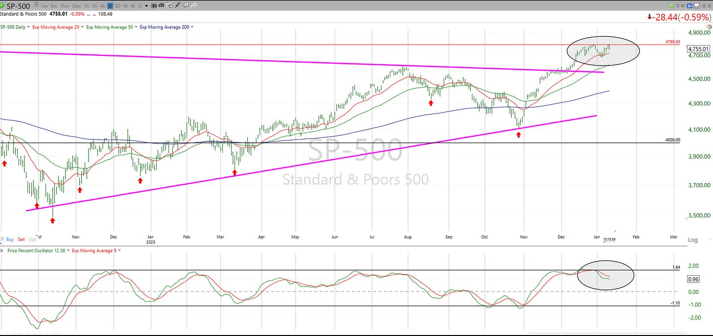
And that is why the current S&P 500 chart is, as the title of this post says, a case of a deluge of happy vibes about the future direction of stock prices, but without the market actually showing it can live up to that rosy vision of a future. The chart below, particularly the ovals on top and bottom, shows me a market whose story goes like this: “I’ll just hang around here like I don’t hear all of you optimists, but I won’t slide just yet because I don’t hear the bears either.”
So, while many pundits talk about how the market loves them and will reward them soon, the market hasn’t yet shown them that.
The stock market is just hanging out, probably on its phone, playing a game, and only reacting to anything from the outside world by occasionally saying “uh huh” or “yup.” Like a lot of teens. So until it makes up its darn mind, it is more of a coin flip as to the next move of magnitude (which to me is 10% up or down).
Re-Introducing:
The ETFYourself.com Depth Chart!
You asked for it, you got it. And we’re pleased to deliver it. This free weekly edition has a table ranking the relative attractiveness of 10 major market indicators, represented by ETFs that track them.
This week’s edition of this new 10-ETF macro depth chart for all subscribers shows a slight change in tone, typical of a stagnant, indecisive market like the one we are clearly in. Versus last week, growth stocks look a bit better relative to value stocks, so that lifts SPYG to the #4 in this relative ranking. SPYV drops down, along with small caps (IJR) and long Treasuries (TLT).
This won’t be too exciting every week, or even week to week, but the top takeaway I see as of right now: cash is still king (BIL), and for commodities, like the old expression: “so you’re saying there’s a chance?” Yes, a chance. But not a confirmed rally or even close to that. More like a possible start of a bottoming process, but no more.
Premium subscribers will see soon see a transition in the content in the research deck they have 24/7 access to:
We shrunk the watchlist from about 190 to 100, based on subscriber feedback that agreed with my suspicion that 100 was plenty for a “focus list” to consider for the model portfolios. This is because so many slices of the market tend to correlate highly, which means we’re just analyzing the same thing in a different ticker symbol. So 100 is the slimmed down list.
In the premium research deck, you will now see a new tab called “Depth Chart” which provides easy to understand tiers, indicating which of the chart patterns for those 100 ETFs are in the most favorable position, which look like a mess, and which are not providing a clear enough signal just yet.
We continue to track all 100 ETFs using our technical ratings. The difference between the depth chart and the technical ratings: the latter are generated using a formula I developed and tested and have used as an input to my investment process for many years. The Depth Chart is my “eyeballing” of the charts as I do very frequently, to try to derive the “story” the market is telling us at any point in time. The premium depth chart tab simply ranks them in groups, and are based on a short-term time frame (1-3 months out).
SAVE THE DATE: our first AMA “CHARTY PARTY!”
Given the tremendous interest in the charting part of what we do at ETFYourself.com, our next “Ask Me Anything” session will be 100% devoted to charting, learning and communicating what some call my investing “secret sauce.” I just hope the session doesn’t affect your body’s system like a Big Mac.
We’ll affectionately refer to this as the AMA “CHARTY PARTY.” Feel free to bring the beverage of your choice to this live video event.


