


Less talk, more action (= charts!)
Our weekly ETF charting education focus

At ETFYourself.com, we are really about 2 things:
Explain investment strategy, research and portfolio-building in plain English
Try different ways to communicate that, since so much of investing is like this quote I’ve seen in many cartoons: “I still don’t understand how the stock market works and I’m too afraid to ask”
So this week, instead of talking your eyes off with a long-form written piece, I’m going to simply show a handful of charts I think are important, and briefly comment on them. Note that as with everything we do here, none of this is telling anyone else what to do, just what I see and think.
This is research, not investment advice
If you have ANY questions about them, join us in the ETFYourself.com subscriber chat, we are launching today for that very purpose. Thanks to our growing community of humble investment learners (as we refer to it), the volume of questions now demands a chat area, so everyone can partake as much or little as they wish.

Now, on to some charts I think matter right now
This Asia ETF is soooo close to breaking out from a 3 year down trend. It’s 30% China, but India and other regional markets play a big role.

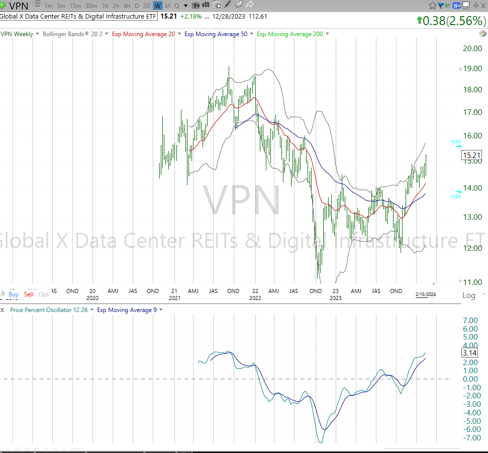
I am regarded by many as a “chicken-$#* investor” and I wear that proudly. Looking for risk-managed ways to pursue stock market gains has kept me solvent. There is a growing case for a tech-led melt up and that makes ETFs like VPN intriguing. That’s a breakout, but from already-high levels. 20% upside to its old high, and it invests in data center-focused REITs. So this is one consideration to partake in a potential continuation of a tech-obsessed rally.
Here’s another “flyer” that could keep going if the market continues feeling good about itself. This is an active ETF run by my friend Dan Weiskopf and the fine folks at Tidal Financial Group. That’s not why I’m including BLOK here. I’m just about the charts, and this one is “climbing the ladder,” thanks to Bitcoin’s roughly 25% move the past 3 weeks. This owns blockchain stocks, not cryptocurrency. Either way, it fits the melt up scenario if that plays out.

Into each life, some rain must fall. And right now, its raining natural gas, whose current price is about the same as it was in 2002. It recently had its fourth “reverse split” since 2011. Unlike when a $200 stock splits 2-for-1 to award double the shares at a lower price so more folks can buy it, this is the opposite. The price got so low, they had to raise it by exchanging every 4 shares for 1 higher-priced share. Citigroup did the same type of thing after the Global Financial Crisis. So yeah, its that bad for UNG. Still, if it does ever “catch a bid” for more than a trade, it could have massive upside. But for now, it’s raining hard.

Finally, my favorite educational topic, the fact that the biggest 1,000 stocks in the US have an average return since March of 2021 (nearly 3 years ago) of about…0%. All those stock picks, all that research and even including the heroics of those Magnificent 7 giant stocks, the net-net was still nothing. EQAL is in the middle of a range it has not broken out of since late 2020 (around $37-$48). The next truly joyous up market doesn’t start until this ETF is at least 10% higher, and showing no signs of slowing down.

Hopefully these charts give you a peek into how I scour the global markets to accumulate hard evidence of the “story” the market is trying to tell us. Right now, there are reasons for optimism, but more like a crescendo than a new dawn for stock investors.
If enough folks tell me they liked this, I’d do it every Thursday. If it isn’t obvious, I love teaching this stuff to our subscribers, just as my late father taught it to me starting 44 years ago.
Here’s our updated depth chart, covering my relative ranking of 10 major market segments, through the ETFs that represent them.
Premium subscribers can take a look at their shared research deck Google sheet, which has 2 updated lists:
The “Tactical 10”: 10 ETFs for fresh money, shorter-term time frame
The “Long-term 10” 10 ETFs for long-term aggressive appreciation potential
The ETFYourself.com Depth Chart (free version)

Last week in this space, I called attention to the fact that growth stocks (SPYG) looked ready to bust out. Then came the calamity of Tuesday’s 2% intraday drop in SPY and % in small caps. But as is typically the case these days, it was just a way to scare off some folks, so most of the market could continue to do “net-nothing” for a bit longer.
This week’s highlighted (yellow) symbol is my observation that while long-term bond yields may have done an about-face lately, the 7-10 year area of the bond curve looks marginally worse than the longest bonds (TLT) of 20-30 years maturity.